
Guest Written by Gael Meza
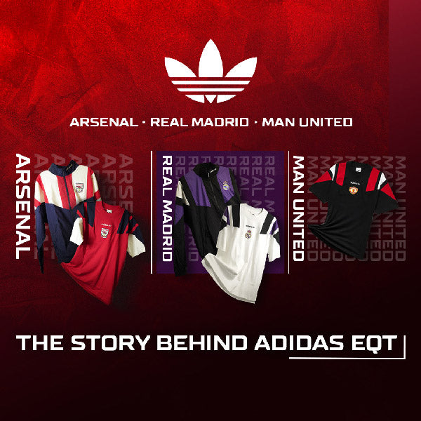
If you’ve watched Arsenal, Real Madrid, Manchester United, Liverpool, or Bayern Munich walk into the stadium this season, you’ve already seen it. Huge oversized blocks of color across the shoulders, crests and logos dead center, not a single sponsor in sight. It looks brand new, though it isn’t. That design is 35 years old, and it has a name: adidas Equipment.
Origin
adidas Equipment dates back to March 1991 and was created with one goal in mind: to revive adidas. At the time, adidas was struggling with identity issues. To keep the brand afloat, they brought in two ex-Nike professionals with several high-profile projects under their belts. Peter Moore and Rob Strasser. Moore was a big shot, having designed the original Air Jordan 1. Strasser convinced Jordan to partner with Nike over adidas. These two started the revitalization of adidas by digging through the Herzogenaurach (adidas HQ) archive for a single principle from founder Adi Dassler: only the best for the athlete.
Philosophy
The 80s were a wild, loud time for fashion. Bright colors everywhere, huge logos, as much of everything as possible on a single piece of clothing. Equipment went the other way on purpose. Moore and Strasser wrote highly specific rules controlling logo size and placement, and dropped the familiar (at the time) adidas blue for industrial black, white, and sub-green. The idea? Get everything else out of the way and let the product speak for itself – and speak it did.
The Soccer Takeover
On the pitch, that same minimalist philosophy became one of the sport's most recognizable looks. Thick three stripes across the shoulder, bold color blocks, and a loose fit nobody would have thought to design then. Because of its immense success, adidas used it as a template. They applied this design across multiple clubs and countries, recoloring and re-cresting it for whoever wore it. The Germany 1994 World Cup EQT design alone appeared on multiple high-profile clubs, including Boca Juniors, Club America, Hamburg, and Besiktas.
A Visual Language
The most common design appears on tops, especially jerseys and lifestyle cotton T-shirts. It consists essentially of these main attributes: oversized geometric blocks over the shoulders, a bold base color, no sponsors whatsoever, and the adidas Trefoil directly above the club crest. Though this design tends to differentiate across various pieces of clothing (tracksuits, bottoms, even cleats), the overall minimalist aesthetic stays true regardless of the item. This visual identity has remained almost unchanged across 35 years of EQT releases, making it less a template and more a language of its own.
New Gen EQT

For the 2026/27 season, adidas built full-on equipment capsules for Arsenal, Real Madrid, Manchester United, Liverpool, and Bayern Munich. Each one follows the same product line: a retro jersey, a cotton tee, and pieces like track tops and crewnecks, each item carrying the previously discussed “visual identity”, exactly as Moore and Strasser intended. Arsenal’s is the purest, pulled straight from the OG 1992 design with a navy base, white shoulder blocking forming the three stripes left to right, red sleeves, and the classic Victoria Concordia Crescit crest. Liverpool went boldest, running a unique teal base against extremely contrasting black blocks. Real Madrid stayed clean in their signature white with an unexpected use of purple shoulder blocking. Bayern Munich leaned into the red, white, and blue of their early 90s kits while Manchester United stayed on-brand with a deep red base and black accents.
The Verdict
Equipment started as a decision to simplify, a clean slate designed to give only the best for the athlete. In a business built on getting noticed, it’s a pretty risky idea to focus on understated in a sea of flash – which is why the classic look still holds up while most of what surrounded it now looks dated. Shop all of the adidas Equipment collections in-store and online at SoccerPost.Com.


